The 8 main reasons to have a responsive website
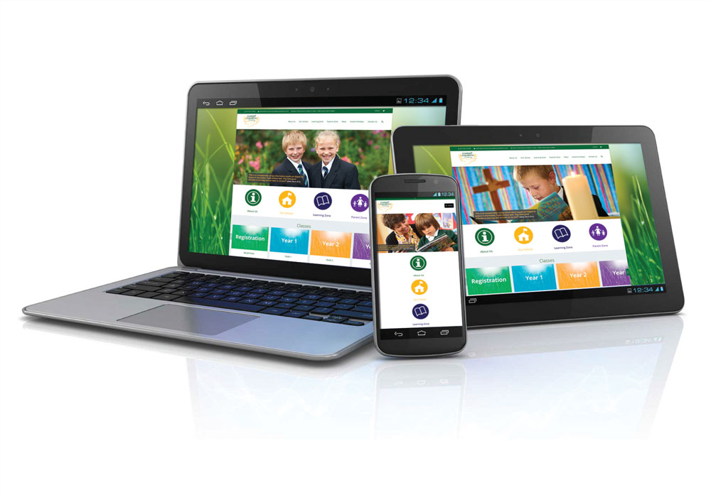
The 8 Main Reasons to have a responsive Business Website.
It will come to no surprise the growth of mobile devices, in modern society, of smart phones and tablets and the device usage via games, apps, social media and websites. With that in mind it is crucial your business website is mobile friendly – ‘RESPONSIVE’ – so that existing and prospective clients can easily browse and find information regardless of what type of device they use to do so. Here they are:
1: Increase in mobile usage
Through research & analytics it shows that on average 60% of people visiting websites do so from tablets and mobile phones. That percentage will continue to grow and therefore existing & potential clients are likely to have a poor experience on an unresponsive site will more than likely think less of your brand and start looking at competitors.
2: Growth in shopping from mobile devices
It’s a known fact that online shopping is steadily on the increase and if your products aren’t easily viewed due to an unresponsive site then they are likely to go to a competitor.
3: Social Media increases mobile visitors
It is said that over 55% of social media consumption comes from mobile devices, so sharing links from social media sites such as Facebook, Twitter, LinkedIn etc. to your website will mean more traffic and viewing of your website from mobile devices. Therefore if you are looking to share content you need to be responsive.
4: SEO rankings improve with responsive sites
Google recommends responsive development for mobile web design. Responsive sites will boost your Google rankings. Additionally, Google likes that responsive sites use single URLs vs. different URLs for separate mobile versions of websites. Mobile devices now use a different algorithm to desktops so even if it appears high when searching on a desktop it wont be doing via a mobile device unless it’s responsive.
5: Responsive designs adapt to multiple devices size
It is important that your website looks good on whatever device or screen size and there for needs to be responsive. It will also work on such devices as smart watches and Google Glass.
6: Responsive Site = One Site: Easier to manage and increase ROI
It has been common practice to have 2 sites; a main site and a mobile version; which would mean multiple versions to manage and update. One responsive site will adapt to every device.
7: Responsive sites provide better user experience
A responsive site provides a far better experience with no more slide scrolling, pinching and zooming to see an entire site that doesn’t fit on a mobile screen. It will also improve brand perception and the audience will be able to find what they need quickly and easy. This will decrease people leaving the site at the home page and going to a competitor.
8: Better bathroom experience
Slightly off putting subject but it is a fact that people, including myself, do browse their mobile devices whilst using the bathroom. A responsive site will give a far more positive user experience.
If you would like to discuss this article and would like to know more information regarding making your website responsive please call James Dawson on 01274 532278 or email james@pmdcs.co.uk